seaborn是一个python可视化的工具,是基于 matplotlib ,能与 dataframe 数据结构有更好切合的工具。
Seaborn可视化
1 | import numpy as np |
Populating the interactive namespace from numpy and matplotlib
先用pandas读进来一份数据
1 | names = [ |
| mpg | cylinders | displacement | horsepower | weight | acceleration | model_year | origin | car_name | maker | |
|---|---|---|---|---|---|---|---|---|---|---|
| 0 | 18.0 | 8 | 307.0 | 130.0 | 3504.0 | 12.0 | 70 | America | chevrolet chevelle malibu | chevrolet |
| 1 | 15.0 | 8 | 350.0 | 165.0 | 3693.0 | 11.5 | 70 | America | buick skylark 320 | buick |
| 2 | 18.0 | 8 | 318.0 | 150.0 | 3436.0 | 11.0 | 70 | America | plymouth satellite | plymouth |
| 3 | 16.0 | 8 | 304.0 | 150.0 | 3433.0 | 12.0 | 70 | America | amc rebel sst | amc |
| 4 | 17.0 | 8 | 302.0 | 140.0 | 3449.0 | 10.5 | 70 | America | ford torino | ford |
一般绘图:factorplot 和 FacetGrid
根据2个维度变量绘图
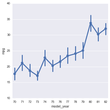
1 | # 画出model_year和mpg的关系图 |
<seaborn.axisgrid.FacetGrid at 0x141170f90>
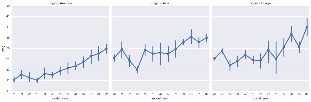
可以按照第3个维度绘制不同的关系图
1 | sns.factorplot(data=df, x="model_year", y="mpg", col="origin") |
<seaborn.axisgrid.FacetGrid at 0x1411827d0>
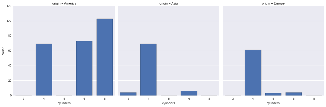
可以从折线图切成柱状图
1 | sns.factorplot("cylinders", data=df, col="origin", kind='bar') |
<seaborn.axisgrid.FacetGrid at 0x13eff0810>
1 | g = sns.FacetGrid(df, col="origin") |
<seaborn.axisgrid.FacetGrid at 0x13e964b90>
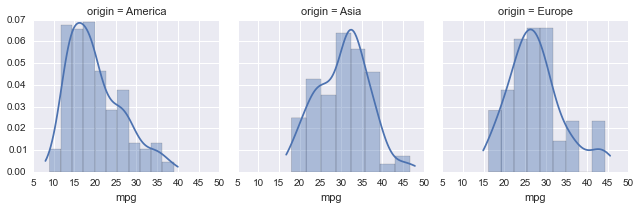
散点图
1 | g = sns.FacetGrid(df, col="origin") |
<seaborn.axisgrid.FacetGrid at 0x138cd2f90>
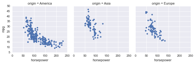
绘图的同时还做回归
1 | g = sns.FacetGrid(df, col="origin") |
(0, 60)
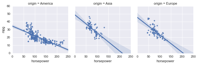
kde等高线图
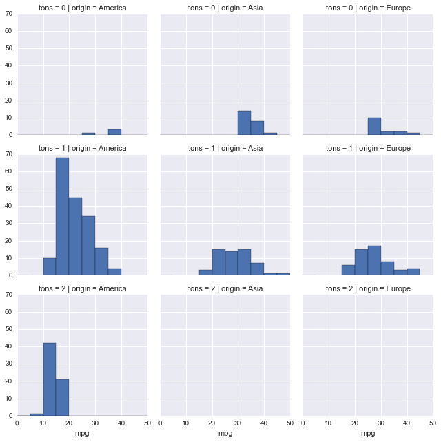
1 | df['tons'] = (df.weight/2000).astype(int) |
(0, 60)
按照2个维度展开画图
1 | g = sns.FacetGrid(df, col="origin", row="tons") |
<seaborn.axisgrid.FacetGrid at 0x131e0f610>
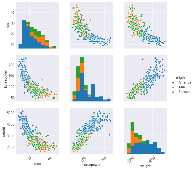
pairplot and PairGrid
多个维度两两组合绘图
1 | g = sns.pairplot(df[["mpg", "horsepower", "weight", "origin"]], hue="origin", diag_kind="hist") |
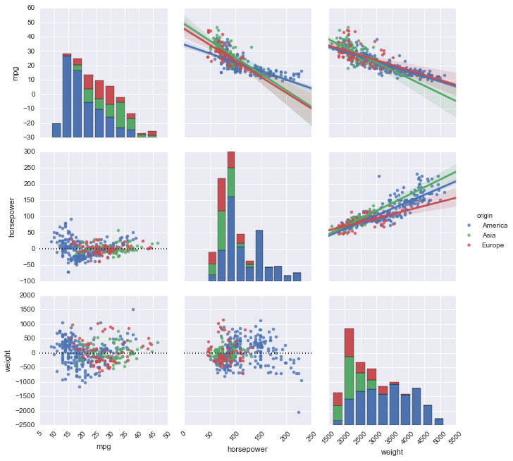
组合绘图的时候顺便回归一下
1 | g = sns.PairGrid(df[["mpg", "horsepower", "weight", "origin"]], hue="origin") |
<seaborn.axisgrid.PairGrid at 0x13eac5790>
jointplot and JointGrid
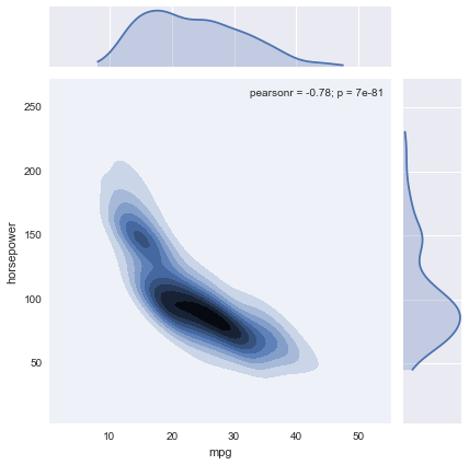
联合绘图(kde等高)
1 | sns.jointplot("mpg", "horsepower", data=df, kind='kde') |
<seaborn.axisgrid.JointGrid at 0x1393a5d10>
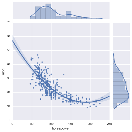
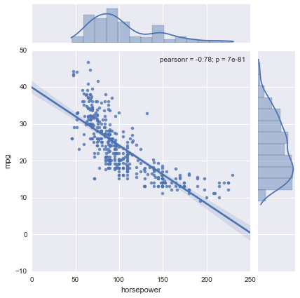
联合绘图(加回归)
1 | sns.jointplot("horsepower", "mpg", data=df, kind="reg") |
<seaborn.axisgrid.JointGrid at 0x141b640d0>
1 | g = sns.JointGrid(x="horsepower", y="mpg", data=df) |
<seaborn.axisgrid.JointGrid at 0x141cd8690>